
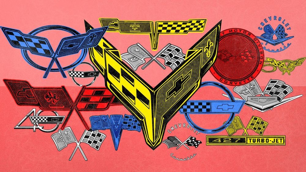
History of the Chevrolet Corvette Logo: Crossed Flags Forever
We take a look at 70 years of changes to the logos and badging used for the Corvette.
Steven Rupp Writer; Benjamin Hunting Writer; Ryan Lugo Illustrator | April 20, 2024
The Chevrolet Corvette’s history dates back to the early 1950s, when GM design boss Harley Earl decided it was time to take advantage of the newfound passion for European sports cars and racing that many American servicemen had brought home with them in the years immediately following World War II.
It’s only natural, then, that the Corvette logo has incorporated a checkered-flag motif since day one—a reminder of its ties to the grassroots racing that spurred its early development and the competitive spirit that kept it in the zeitgeist for the next 70 years. Over time, the crossed-flags concept from that original emblem has continued to evolve alongside new styling trends and as fresh ideas were breathed into Chevy’s iconic sports car by those who worked hard to maintain the Corvette’s status as the brand’s spiritual flagship.
The Corvette Logo That Never Was
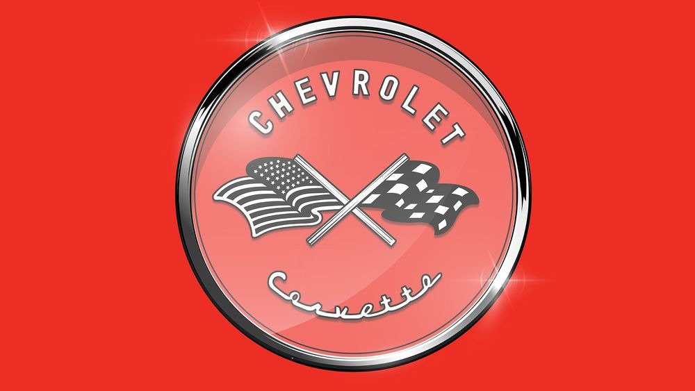
The very first Chevrolet Corvette logo, designed by Robert Bartholomew, never saw the light of day. Conceptually, it introduced the crossed-flags motif that served as its foundation moving forward (with CHEVROLET arching at the top of the round emblem, and CORVETTE in script at the bottom), but with the added wrinkle that one of those flags featured the Stars and Stripes. Spooked by an obscure, rarely enforced law that forbids the commercial use of the American flag, GM’s lawyers nixed the idea at the outset, and forced a rapid rethink.
The Corvette Logo for a Day (or Two)
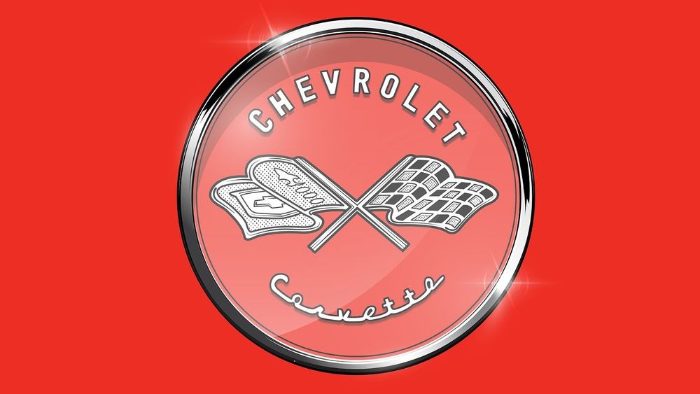
The solution was found when mining the family history of the company’s founder, Louis Chevrolet—sort of. Although GM’s researchers came up short when searching for any kind of familial crest or heraldry that could be adapted into an emblem, they did decide to take advantage of Chevrolet’s French ancestry.
To that end, the checkered flag was retained while the American flag was replaced by one that combined both a fleur-de-lis and the Bowtie logo that was itself an indelible aspect of the brand’s history. This logo was shown during the Corvette’s public unveiling at the Waldorf-Astoria hotel in 1953, but once the photo-op passed, it was again time for something different.
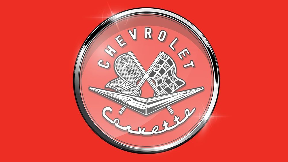
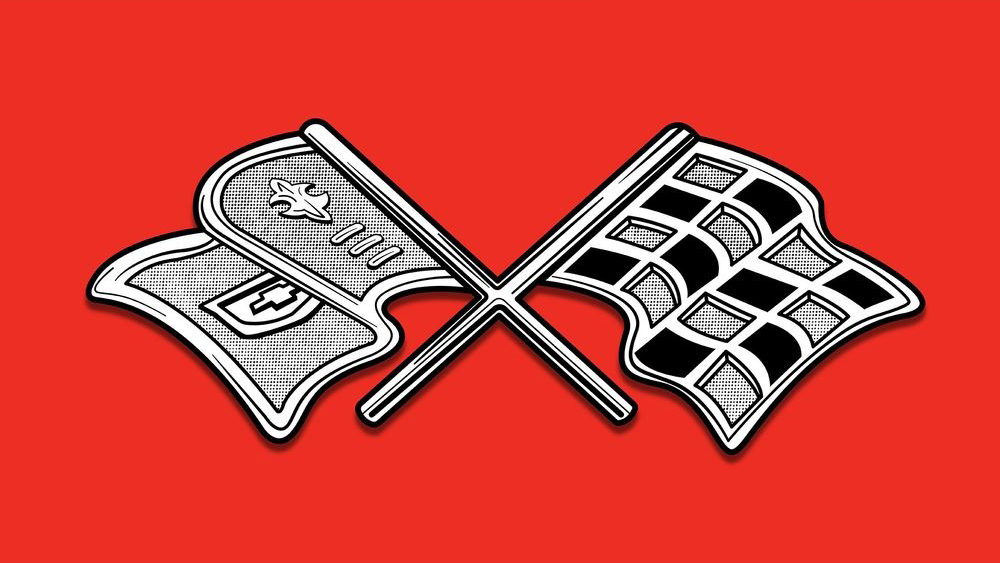
The First Run of Production Corvette Logos
From 1953 to 1962, Chevrolet experimented with variations on the crossed-flags theme that had been seen in New York at the official unveiling. The first prominent change occurred in 1956, when a chevron was imposed across the flags (which would themselves get wavier), and soon the original cursive script was scrapped in favor of block letters advertising brand and model, top and bottom.

1962: Enter the Tri-Color Bar
Chevy continued to play with flag shape and colors on the badge until 1962, when a tri-color bar (red, white, and blue, of course) was imposed just above the chevron.
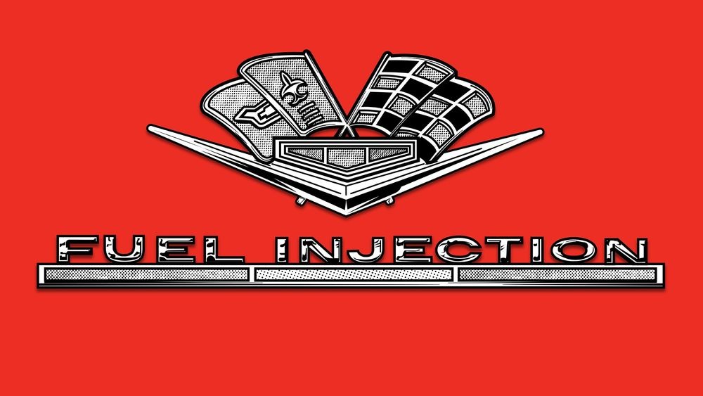
The C2 Corvette Introduces Fuel Injection
Starting with the second-generation car, Corvette designers began calling out various features and model names in association with the logo itself. It’s here that words like FUEL INJECTION and of course STING RAY first rose to prominence, appearing at times on the front fenders or the rear deck in proximity to the emblem, often with CORVETTE embossed in scripted lettering just above.
1961 Ditches the Circle and Script
The emblem for 1961 incorporated all the design elements from before but without the Chevrolet Corvette script, and sans the circle. The result is what we find to be one of the most clean and iconic of the Corvette badges.
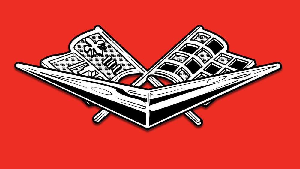
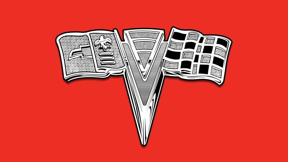
Return of the Tri-Color Tri-Bar
In 1963, the Corvette debuted a badge orienting the crossed-flag stems into a V shape in which an upside-down triangle incorporated the red-white-blue motif of the previous year.
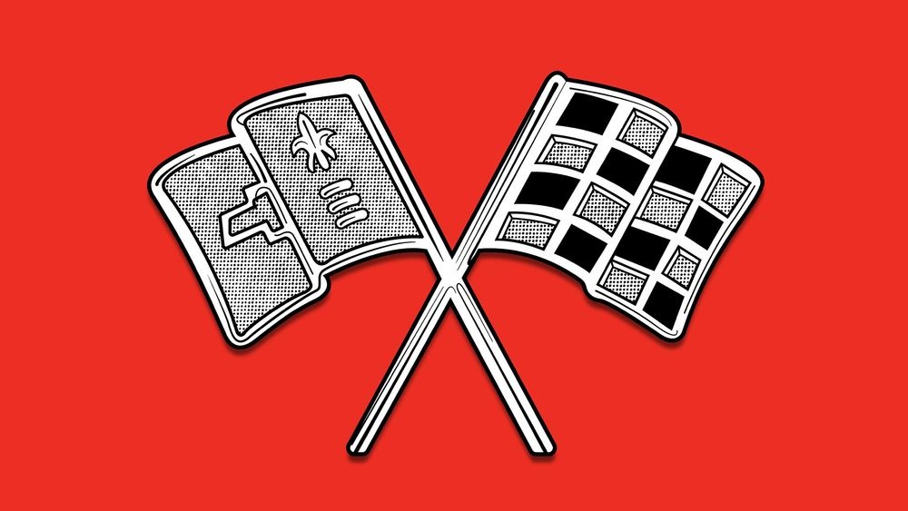
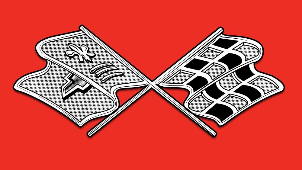
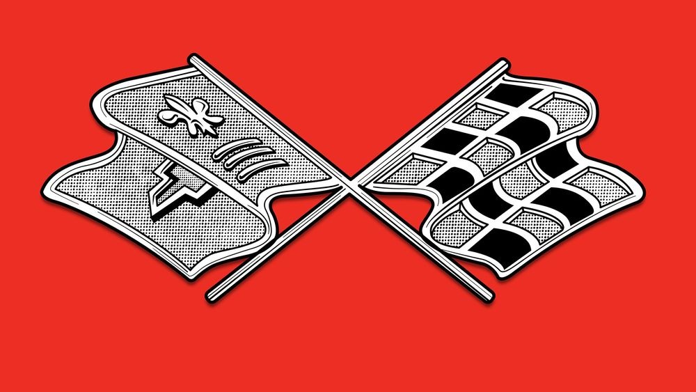
A Simpler Design With Crossed Flags for 1965
This gave way to a return to the more traditional flag design in 1965. The left flag retained the fleur-de-lis and Chevrolet logo.
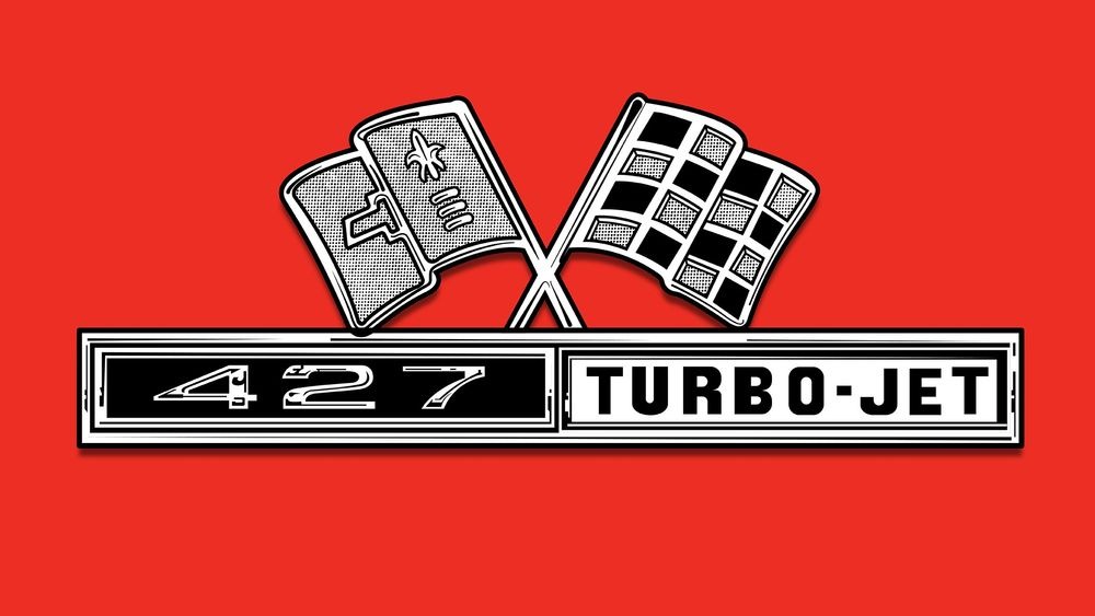
Engine Call-Outs
Some emblems incorporated call-outs for the higher-performance engine offerings. Here you see the emblem for a 1966 big-block-powered Corvette.
Getting Aggressive for 1967
Chevrolet decided to go with a more aggressively angled version of the 1965 badge for the 1967 cars, but the flag designs stayed the same.
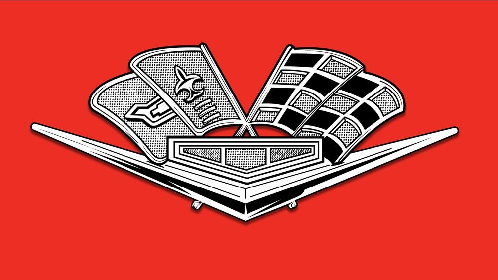
Location, Location, Location
Often there were several logo variations on the same model year car, depending on placement. Here you can see the nose logo for a 1963–1964 Corvette that incorporated all the standard design elements, such as the V, flags, and tri-bar.
Simpler Is Better, Mostly
The nose emblems on the 1968–1972 models and gas caps were simplified, going back to a more traditional crossed-flags design. It was common to tweak the design to fit where the emblem was going to be placed on the Corvette.
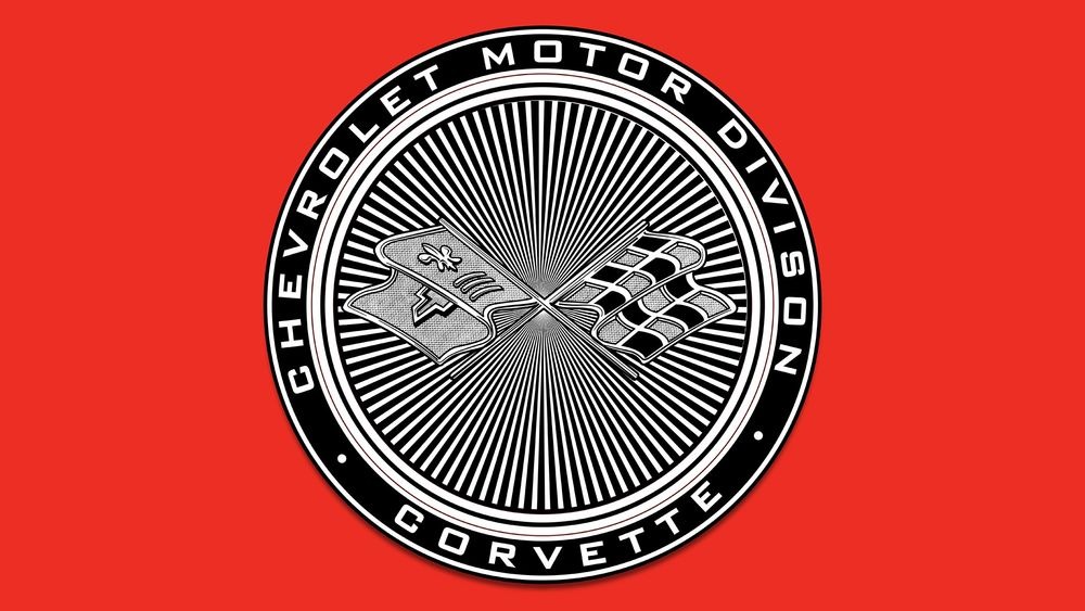
The C3 Corvette Stays the Course
When the Corvette was redesigned for 1968, it carried over the same crossed-flags logo from the C2. That design remained unchanged until 1973, when this dramatic round emblem featuring a red background and a perimeter that read CHEVROLET MOTOR DIVISION on top and CORVETTE on the bottom became standard.
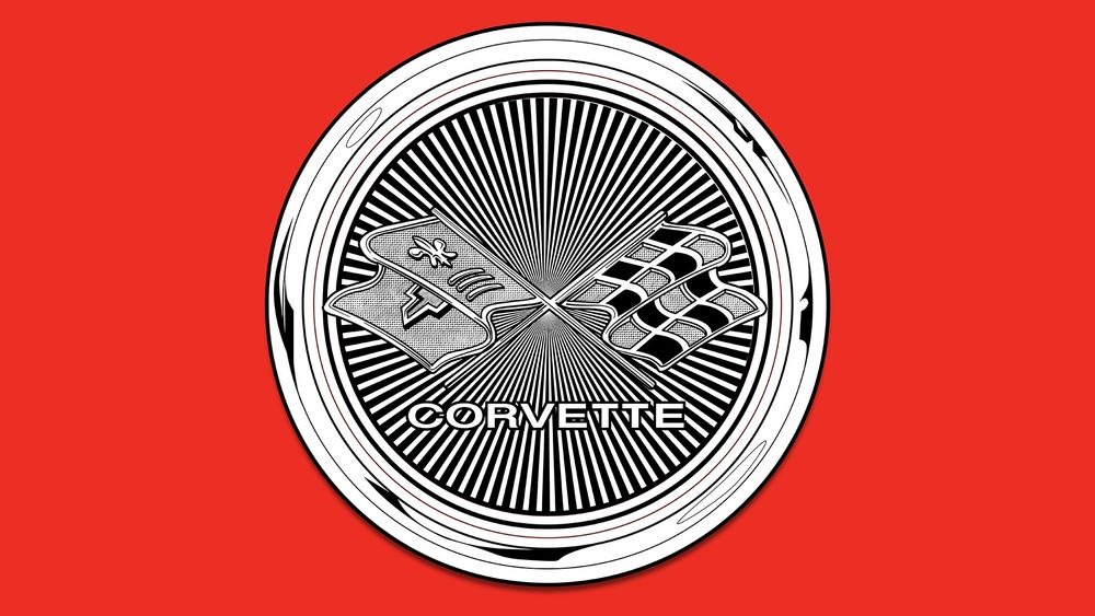
Simplicity for 1975
To simplify things and declutter the car a bit, those words were erased from the badge in 1975, resulting in a clean circular badge. However, the CORVETTE lettering was added to the center.
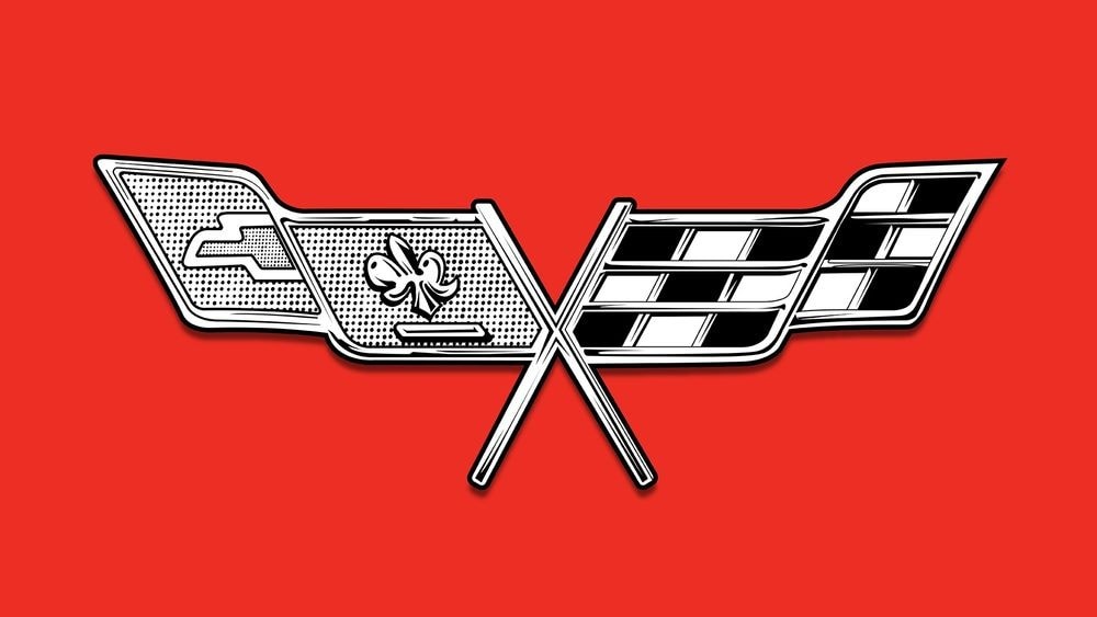
Ditching the Circle for 1977
By 1977, the circular motif was gone in favor of a pair of stretched flags. This flatter and wider flag design would carry forward into future emblem designs.
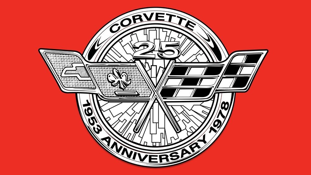
Special Badges for 1978 and the Start of a Trend
For 1978, Chevrolet commemorated the Corvette's 25th anniversary with a busy silver roundel that placed 25 directly above the flags (which were embossed on top). CORVETTE was written along the top edge of the circle, with 1953 ANNIVERSARY 1978 along the bottom, just to make sure that you got the point. The following year the Corvette returned to the same, much simpler logo it had in 1977.
Flatter, Wider, Blockier
The final few years of C3 production hinted at the blockier emblems that would dominate the new decade. For 1980 and 1981, the flags featured a tight V with a design resembling an eagle’s wings.
Goodbye Fleur-de-Lis—for Now
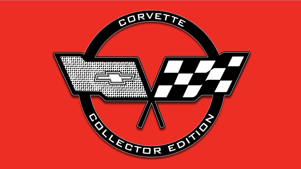
The flags were truncated for 1982 into a parallelogram-type shape that excluded the fleur-de-lis for the very first time. Some models received a hollow CORVETTE COLLECTOR EDITION ring around the emblem.
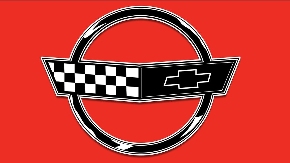
The C4 Corvette Simplifies the Logo
When the fourth-generation (C4) Chevrolet Corvette arrived in 1984, it brought with it the most uncomplicated emblem to date. The look maintained the open circle as a frame, with a V-shaped flag look—minus the poles—that reversed the position of the checkered flag (now on the left) and the bowtie (on the right, with a red background). The fleur-de-lis was still missing and would remain so for the C4’s entire run.
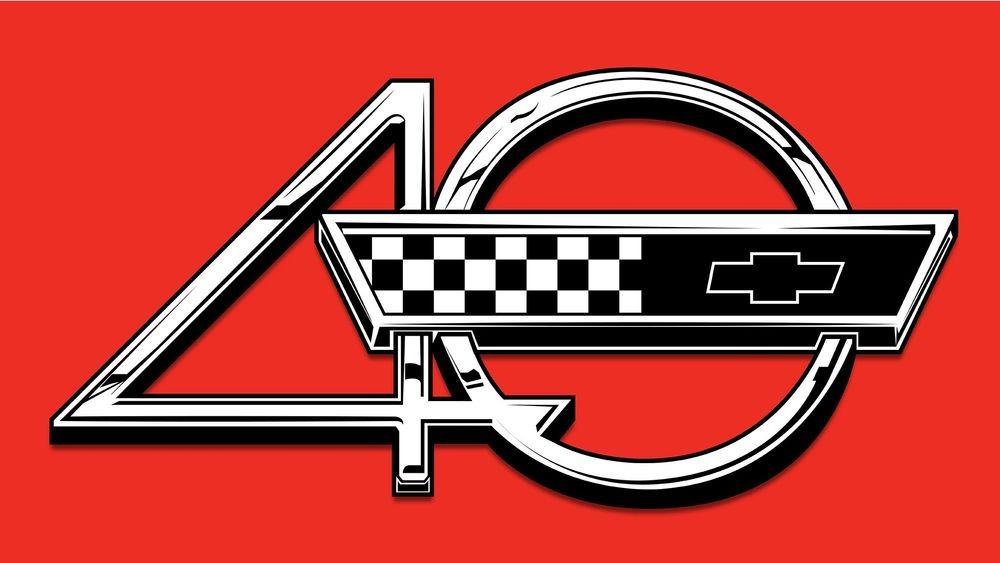
Something Special for the 40th Anniversary
In 1990, the bowtie flag went red-on-black, with a large chrome 4 appearing alongside the ring in 1993 to mark the 40th anniversary. This went well with the C4 Corvette’s futuristic (for the time) bodylines.
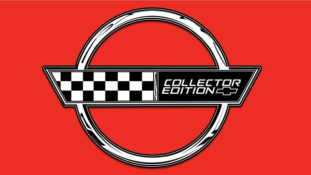
Special Badges for Special Cars
In 1996, the words COLLECTOR EDITION appeared beside the bowtie, rendered in silver, on certain models. The lettering replaced the bowtie on the right side of the flag.
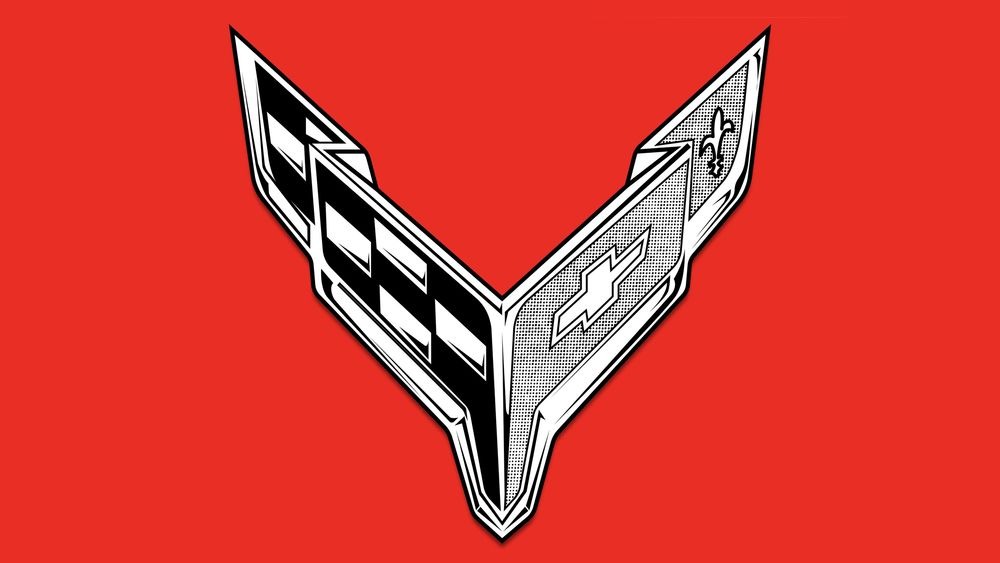
The C5 Corvette Gets Historic for 1997
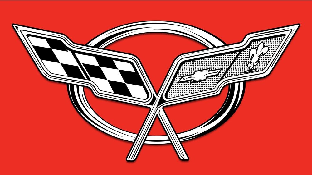
With a 50th anniversary on the horizon, Chevrolet went back to the traditional crossed flags and restored the missing fleur-de-lis in 1997, placed them over a background that was more oval than the C4’s circle. The relatively short lifespan of the C5 compared to its direct ancestor meant no real changes were made to the Corvette logo during its production run, which ended in 2004.
The Big 50!
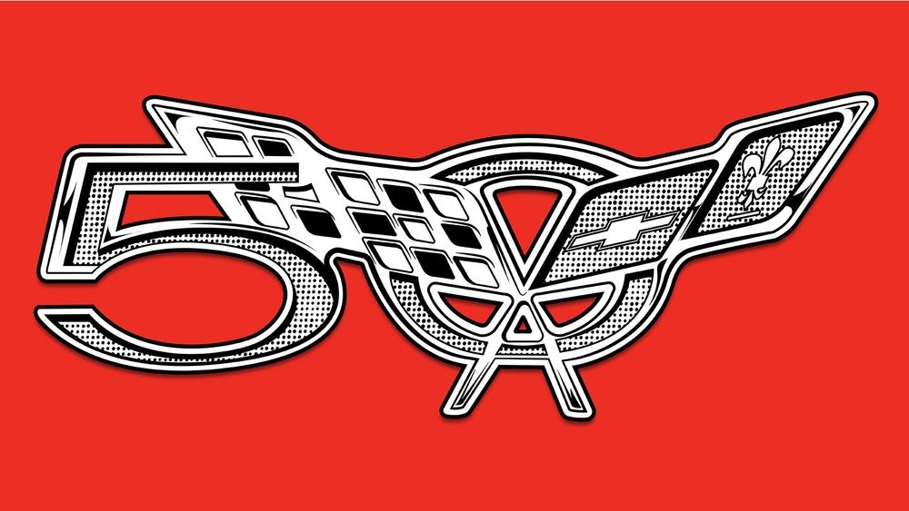
50 years is a big deal, so Chevrolet marked the occasion with a special 50 call-out on the 2003 model’s badge. This was done by tweaking the traditional circle/oval and tossing a 5 to the left of the crossed flags.
Winning and Proud of It!
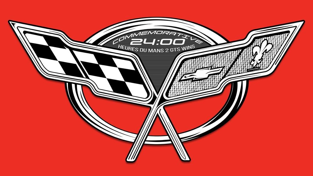
For 2004, there was also a commemorative badge celebrating Corvette’s two wins in the 24 Heures Du Mans! Other than that, the design was the same as what was used in 1997.
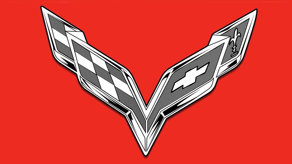
The C6 Corvette Gets Its Wings
When 2005 rolled around and the C6 Corvette went on sale, the crossed flags had morphed into a pair of wings, with their “poles” growing directly out of the drawn-out flag shapes (with a stubbier foundation for the checkered side). Aside from the replacement of the fleur-de-lis in 2012 with 100 marking Chevrolet's centennial, and with 60 YEARS in 2013 to celebrate the Corvette’s most recent birthday, there were no major changes made to the emblem until the C7 arrived in 2014.
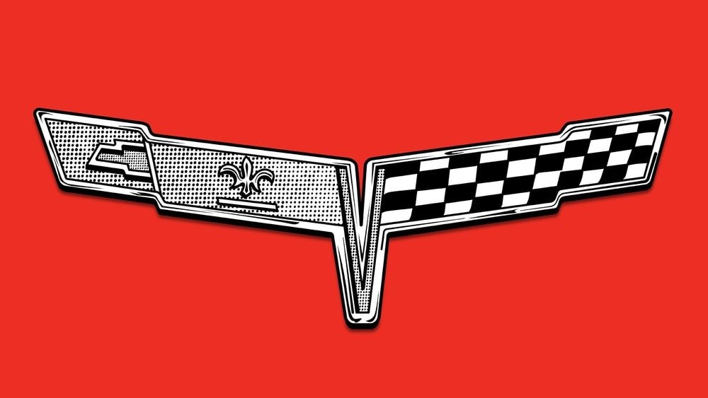
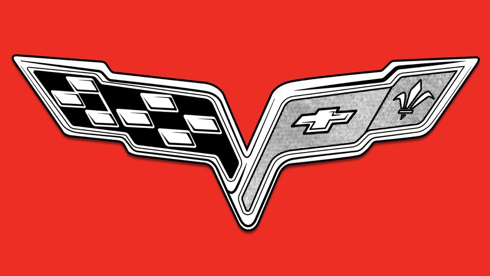
The C7 Corvette and C8 Corvette Logos Go Full Eagle
The C7 Corvette (2014–2019) and C8 Corvette (2020–present) might be incredibly different from a mechanical perspective, but visually their logos have more in common than nearly any other generation of Chevrolet’s sports car. Evening out the stubby flagpoles and angling up the flags themselves gave the C7’s badge the look of a raptor’s wings midflight.
A Chunkier Look for the Mid-Engine C8
This motif was accentuated by the C8’s chunkier look, differentiated from the older car only by the lack of a V-shaped valley in between the two flags (and the replacement of the bowtie with a 70 in 2023 to reflect the anniversary of one of the longest-running sports cars still on the market).
Corvette Logo Changes Through the Years
- 1953–1955
- 1956–1957
- 1957–1960
- 1961
- 1962
- 1963–1964
- 1965–1966
- 1967
- 1968–1972
- 1973–1974
- 1975–1976
- 1977–1979
- 1978
- 1979
- 1980–1982
- 1984
- 1990
- 1993
- 1996
- 1997–2004
- 2003 (50th Anniversary)
- 2004 (Commemorative Edition)
- 2005–2013
- 2012 (Centennial)
- 2013 (60 Years)
- 2014–2019
- 2020–present
- 2023 (70 Years)